An image does work when it provides clinical content in a visual way. An image of an ECG strip, the interior of a heart, or an algorithm of emergency care of ventricular fibrillation do real clinical work.
An image of someone at a computer doesn't do any clinical work. Who hasn't seen someone at a computer?
An image of an apple in an article about nutrition doesn't do any work. It's just there to look pretty on the page.
I hate those kinds of images, and I blame, specifically, Nancy Webb at Weekly Reader and Pat Schull at Springhouse. I love them both; they're incredible editors and incredible people, and they made me this way.
So blame them.
Ask yourself these three questions to make sure the images that accompany your articles or chapters do good work.
#1 Does the image help illustrate a concept?
For every image you want to add, ask yourself, Does it move the content forward?
Let's say you're authoring a chapter on medical assistants using an electronic medical record (EMR). Does a stock photo above of a smiling woman at a laptop, like the one above, do anything to move clinical meaning forward?
No, it doesn't. So don't use it.
But if you used a photo like the one at right, now you've got something. Now you've moved the clinical meaning forward.
See the difference?
#2 Does the image carry the content forward?
Let's go back to that apple in a nutrition article. By itself, the apple image doesn't do squat. It just sits there.
Seriously, who hasn't seen an apple?
Right. So for that article, which describes, let's say, how fact sheets about common fruits can help people better understand nutritional requirements, suppose you used an image like the one at right? Now you've got something worthwhile.
Seriously, who hasn't seen an apple?
Right. So for that article, which describes, let's say, how fact sheets about common fruits can help people better understand nutritional requirements, suppose you used an image like the one at right? Now you've got something worthwhile.
#3 Is the image useful enough to take up valuable space on the page?
Your publisher pays dearly for every inch of space on the page. Do your part to make sure you're using it wisely.
 |
| http://www.cardiorenew.com/october2009.php |
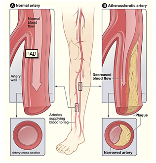
Images that do more than one piece of work always prove valuable. For instance, an illustration that shows blood flow through a partially blocked artery can show (1) narrowing of the arterial lumen, (2) decreased blood flow at the blockage, and (3) how a blockage can lead to disease.
If you aim to make most of your images perform that much work, you'll strengthen your textual content and give the visual reader great help in understanding the concepts.
So stay away from stupid, do-nothing images and make your images do real, honest to goodness work.
Nancy and Pat would be proud.


No comments:
Post a Comment